 This Visualizing the Data series, written by ICLEI Technical Director Mike Steinhoff, gives life to the greenhouse-gas emissions reporting numbers pulled from ICLEI USA’s flagship ClearPath tool. Hundreds of U.S. cities have used ClearPath to initiate greenhouse gas emissions inventories — allowing for a science-based approach to inform decision making and climate action planning. Read the full series in Toward 1.5 Degrees: ICLEI USA 2016 Annual Report.
Read Part 1: Putting the Protocols Into Perspective
Read Part 2: Taking Stock of City GHG Inventories
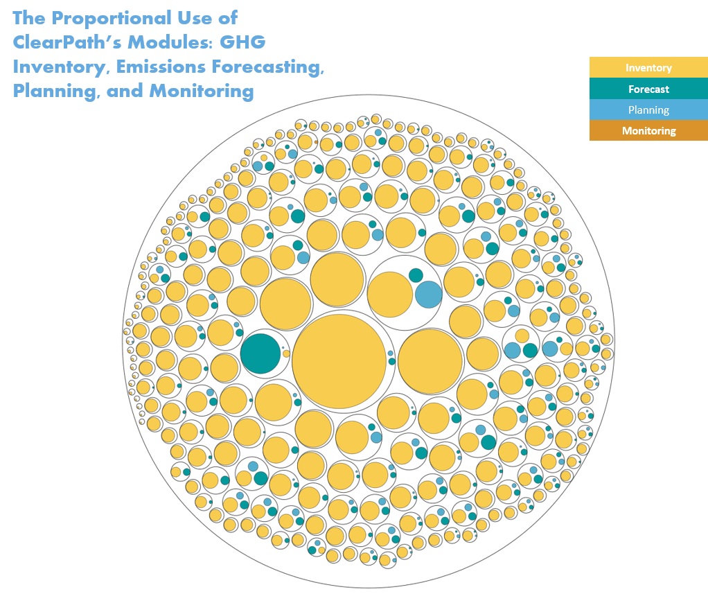
Yes, there is a great deal of GHG inventory data in ClearPath, but use of the other modules is growing. In this bubble chart, the black circles represent individual cities. The colored circles within represent the number of records created in each of the modules by a community. While inventory records dominate, a few users have spent as much effort forecasting emissions trends and planning climate actions as they have in compiling their emissions inventory.
By their nature, inventories will always have more data points than the other functions of the tool. However, over time, we hope to see these distributions even out. Moreover, we hope to see and facilitate more use of the Monitoring Module in the coming years (can you find the dot?).
While creating multiple inventories is one form of monitoring, tracking performance on actions will be critical going forward — so that cities can learn from their reduction strategies and share what works with others. There is clearly a need for more resources to support cities in performing that work.
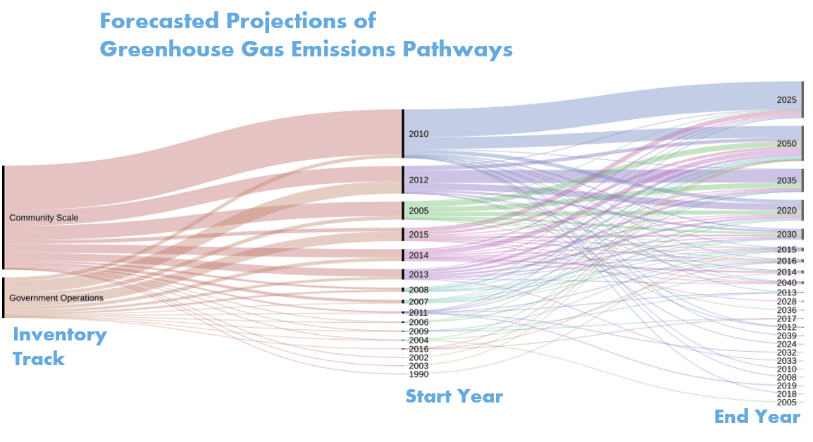
While they may seem relatively few in comparison, there is a great deal of interesting data to explore in the emissions forecasting and climate planning activities of our users. Observing the Forecast and Planning Module scenarios created in ClearPath provides some insight into the planning horizons that cities are considering.
The graphic below shows the relative number of forecasts — from both the Community-scale and Government Operations tracks in the tool — with the starting and ending year of each. We see that most forecasts are created at the community scale and cover the period of 2010-2025.
With as much emphasis as is placed on planning for 2050, it is interesting to see that the year 2025 is a far more common end year ClearPath users are planning for. This may be a reflection that cities are working within planning timeframes aligned with their state governments (or an acknowledgement that projecting the future over very long time horizons is challenging).
Also interesting is that several cities have used this feature of the tool to reconstruct and visualize the pathways from their earliest inventory work done in the early 2000s — and even as far back as 1990.
Read Part 4: Imagining Many Futures
Read our full 2016 Annual Report for more ways cities are using science to inform climate action.